
البدء
تحليل البيانات بعرض الرسم البياني والجدول المحوري
What this does
Turns a list of records into an answer. Most apps have a Reporting menu, and behind it the same two generic views: the graph for spotting trends, the pivot for breaking numbers apart.
Steps
-
01
Open the report from the app's Reporting menu.
-
02
Filter first — a chart of the wrong records is worse than no chart. Set the period and any other conditions in the search bar.
-
03
Switch view with the buttons at the top right: the graph icon or the pivot icon.
-
04
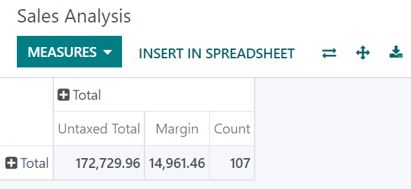
Click Measures and choose what is being counted. Only numeric fields can be measured; Count counts records.
-
05
Add a Group By for the dimension you want to analyse — by month, by salesperson, by product category.
The pivot view
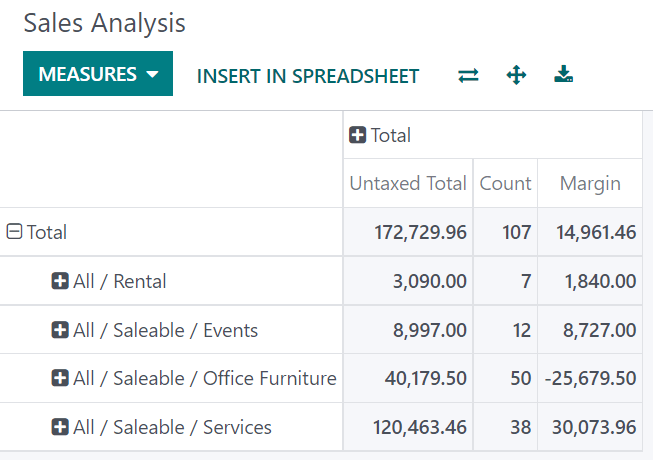
Grouping is the whole point of the pivot. Beyond Group By, click the + next to the Total header — on rows and on columns — and pick a group; − removes it. Groups can be added to subgroups, which is how you drill from a category into the months of one product.
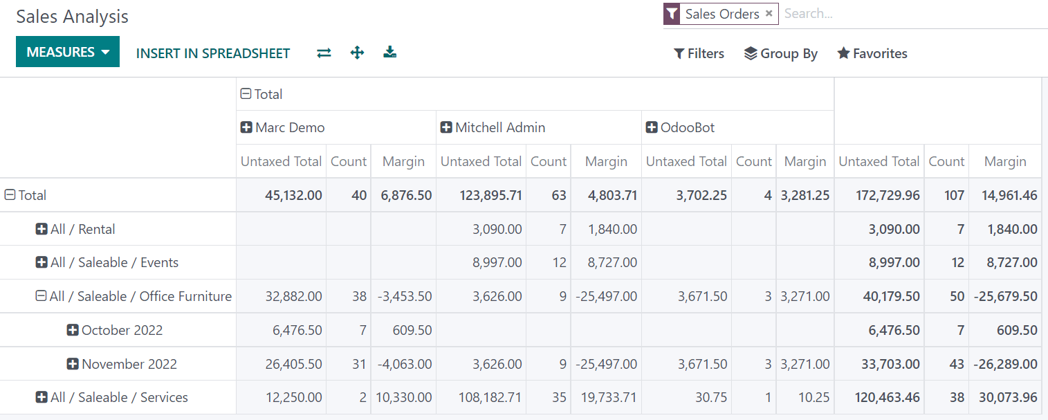
The ⇄ (flip axis) button swaps rows and columns,
clicking a measure label sorts by it, and the
⭳ (download) button hands you the whole pivot as an
.xlsx file.
The graph view
- Bar — comparing categories, and the only one that copes well with a lot of them.
- Line — change over time.
- Pie — the split of a small number of categories that add up to a meaningful whole.
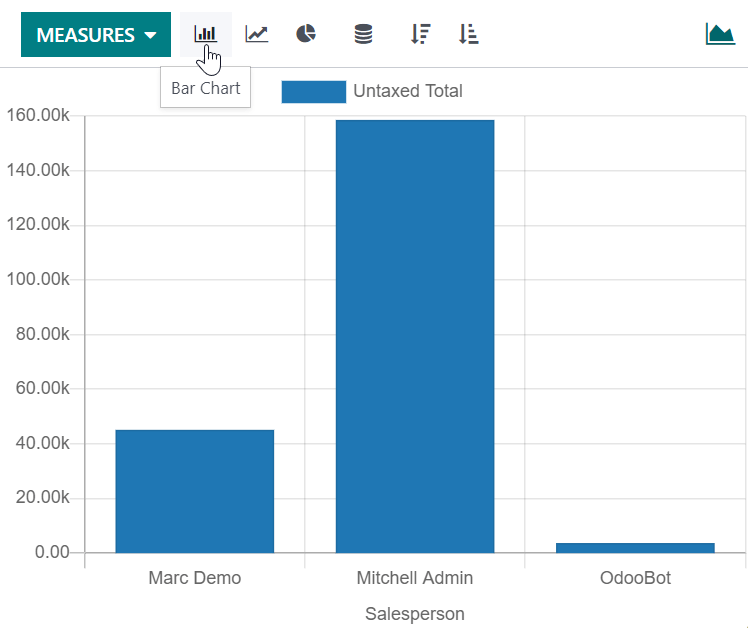
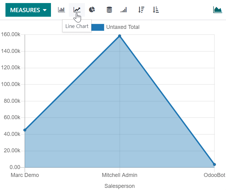
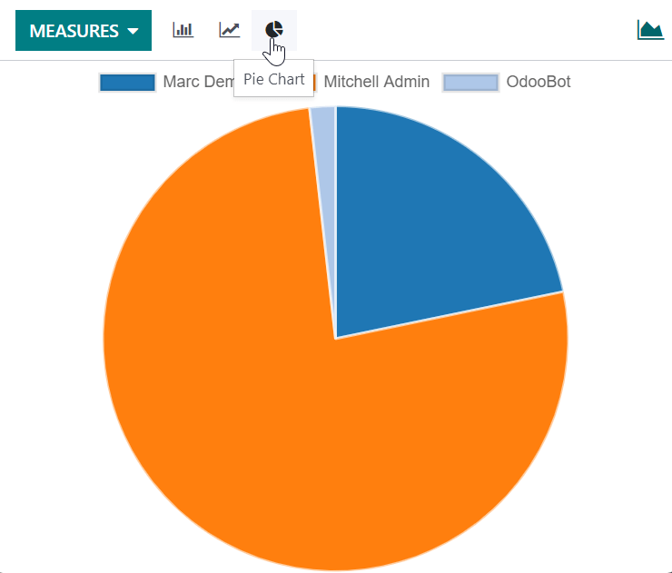
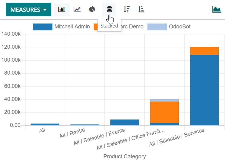
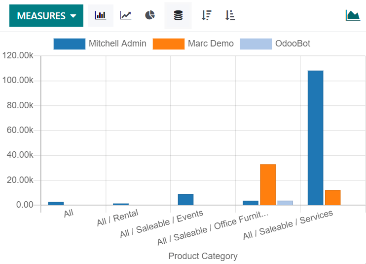
With two groups, bar and line charts can be stacked — the series sit on top of each other and the bar height is the total, instead of standing side by side.
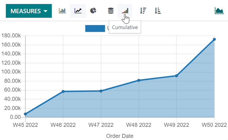
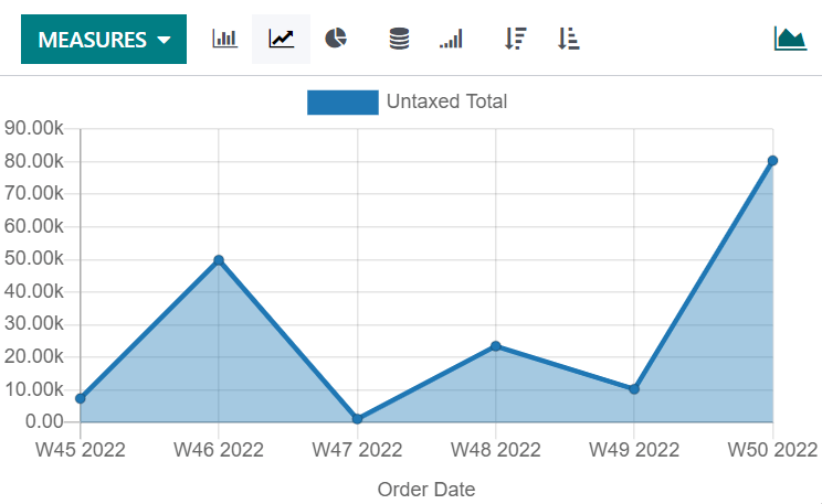
Line charts also offer cumulative, which adds each period to the ones before it — the shape that shows growth rather than month-to-month noise.
Common mistakes
- Reading a chart without checking the filters — the default period is rarely the one you meant.
- Measuring a field that is not what it sounds like: untaxed amount, total, and margin answer different questions.
- A pie chart with twenty slices. Use a bar chart.
- Exporting a pivot and then editing the numbers — the file is a snapshot, not a report that refreshes.
هل كان هذا المقال مفيداً؟
شكراً — ملاحظتك تساعدنا.
تدير مصنع نوافذ أو أبواب؟
اطلب عرضاً تجريبياً